Statistics Quickstart
NOTE This notebook is not meant to teach statistics, but only demo how to run the py50 functions. There are plenty of resources available online. I particularly found introductory tutorials by DATAtab helpful.
The following page will detail how to use the statistic calculations and the corresponding plots in py50. Essentially, py50 wraps three main python modules into a single package.
Many of the functions are used similarly, with statistics using the ‘get_x()’ format, where x is the name. Statistic functions are wrappers from the Pingouin tool. If there are issues with the calculations using py50, the Pingouin may be a be a workaround.
py50 wraps Statannotation, which automatically adds statistical annotations to seaborn plots. The Pingouin statistics is also used to perform calculations. As such, users cna use Plots directly and show the output DataFrame for analysis/checking if needed.
I also wrapped another tool that I like using - scikit-posthocs. This will plot a heatmap based on matplotlib/seaborn and highlight p-values between groups. I do not use calculations from scikit-posthocs, only the plotting options. The calculations come from the Pingouin package. Its usage in py50 requires a final calculated table, the py50.stats functions, before the final figure can be made.
More details on the specific plotting options are given under 009_advanced_plotting tutorial.
[1]:
from py50 import Stats, Plots
import pingouin as pg
from matplotlib import pyplot as plt
[2]:
# Load an example dataset comparing pain threshold as a function of hair color
data = pg.read_dataset('anova')
print('List of Group names in Dataset:', data['Hair color'].unique())

# Initialize Stats and Plots
stat = Stats(data)
plot = Plots(data)

# Visualize data
plot.show(2)  # or stat.show() since same DataFrame
List of Group names in Dataset: ['Light Blond' 'Dark Blond' 'Light Brunette' 'Dark Brunette']
[2]:
| Subject | Hair color | Pain threshold | |
|---|---|---|---|
| 0 | 1 | Light Blond | 62 |
| 1 | 2 | Light Blond | 60 |
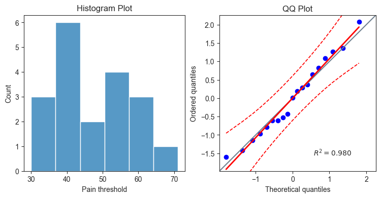
Data Distribution
The data distribution is important to determine patterns that may show up in the dataset. For example, it can also tell you how often a value may occur, the shape of the data, variability of a value, etc.
py50 includes two tests that can help analyze the dataset.
Normality. This will test if the dataset follows normal distribution - i.e. a bell-shape curve.
Homoscedasticity. This will test for the “spread” or consistency of the dataset along a regression model.
[3]:
# Test for normality
stat.get_normality(value_col='Pain threshold', group_col='Hair color').round(3)
[3]:
| W | pval | normal | |
|---|---|---|---|
| Hair color | |||
| Light Blond | 0.991 | 0.983 | True |
| Dark Blond | 0.940 | 0.664 | True |
| Light Brunette | 0.931 | 0.598 | True |
| Dark Brunette | 0.883 | 0.324 | True |
[4]:
stat.get_homoscedasticity(value_col='Pain threshold', group_col='Hair color').round(3)
[4]:
| W | pval | equal_var | |
|---|---|---|---|
| levene | 0.393 | 0.76 | True |
Visualize Data Distribution
Oftentimes it may be quicker and easier to visualize the distribution of the dataset. py50 includes a Histogram Plot and QQ Plot to visualize normality and homoscedasticity, respectively. The plots can be drawn individually, or if called as specific axes, can be combined into a single plot. Here I will draw them together in a grid.
[5]:
# create subplot grid
fig, (ax1, ax2) = plt.subplots(1, 2, figsize=(9, 4))
plot.distribution(val_col='Pain threshold', type='histplot', ax=ax1)
plot.distribution(val_col='Pain threshold', type='qqplot', ax=ax2)

# Adding titles to subplots
ax1.set_title('Histogram Plot')
ax2.set_title('QQ Plot')

plt.show()
Perform ANOVA
Several tests, parametric and non-parametric, are available in py50. They use the “get_x” format. Here, the One-Way ANOVA script will be demoed. The final table will be a Pandas.DataFrame object.
[6]:
# Calculate ANOVA
anova = stat.get_anova(value_col='Pain threshold', group_col='Hair color')
anova
[6]:
| Source | ddof1 | ddof2 | F | p_unc | np2 | significance | |
|---|---|---|---|---|---|---|---|
| 0 | Hair color | 3 | 15 | 6.791407 | 0.004114 | 0.575962 | ** |
ANOVA is a type of omnibus test and determines if a set of groups are statistically different. It does not tell you which group is different. For that, a post-hoc test is needed to perform pairwise comparisons between groups. This will signify which group is statistically significant.
Post-Hoc Tests
py50 comes with several post-hoc tests. Again, this can be called using the same ‘get_x’ phrase. As the above ANOVA test show significance between the Hair color group, a Tukey test will be performed.
[7]:
tukey = stat.get_tukey(value_col='Pain threshold', group_col='Hair color')
tukey
[7]:
| A | B | mean_A | mean_B | diff | se | T | p_tukey | hedges | significance | |
|---|---|---|---|---|---|---|---|---|---|---|
| 0 | Dark Blond | Dark Brunette | 51.2 | 37.4 | 13.8 | 5.168623 | 2.669957 | 0.074068 | 1.413596 | n.s. |
| 1 | Dark Blond | Light Blond | 51.2 | 59.2 | -8.0 | 5.168623 | -1.547801 | 0.435577 | -0.810661 | n.s. |
| 2 | Dark Blond | Light Brunette | 51.2 | 42.5 | 8.7 | 5.482153 | 1.586968 | 0.414728 | 0.982361 | n.s. |
| 3 | Dark Brunette | Light Blond | 37.4 | 59.2 | -21.8 | 5.168623 | -4.217758 | 0.003708 | -2.336811 | ** |
| 4 | Dark Brunette | Light Brunette | 37.4 | 42.5 | -5.1 | 5.482153 | -0.930291 | 0.789321 | -0.626769 | n.s. |
| 5 | Light Blond | Light Brunette | 59.2 | 42.5 | 16.7 | 5.482153 | 3.046249 | 0.036647 | 2.015280 | * |
The calculated results show that only two groups ((Light Blond-Dark Brunette) and (Light Blond-Light Brunette)) with statistical significance.
The output table is the same format as the Pingouin, but with the addition of a “significance” column. This denotes the typical asterisks associated with pvalues. The inclusion of this column is for quick visualization of results.
Sometimes it is easy to forget the numerical values associated with the pvalues. In py50, the values will remain consistent. A reference, as type DataFrame, can be printed out as follows:
[8]:
stat.get_gameshowell(value_col='Pain threshold', group_col='Hair color')
[8]:
| A | B | mean_A | mean_B | diff | se | T | df | pval | hedges | significance | |
|---|---|---|---|---|---|---|---|---|---|---|---|
| 0 | Dark Blond | Dark Brunette | 51.2 | 37.4 | 13.8 | 5.576737 | 2.474565 | 7.906609 | 0.140085 | 1.413596 | n.s. |
| 1 | Dark Blond | Light Blond | 51.2 | 59.2 | -8.0 | 5.637375 | -1.419100 | 7.942669 | 0.522844 | -0.810661 | n.s. |
| 2 | Dark Blond | Light Brunette | 51.2 | 42.5 | 8.7 | 4.965548 | 1.752072 | 6.562510 | 0.371497 | 0.982361 | n.s. |
| 3 | Dark Brunette | Light Blond | 37.4 | 59.2 | -21.8 | 5.329165 | -4.090697 | 7.995416 | 0.014769 | -2.336811 | * |
| 4 | Dark Brunette | Light Brunette | 37.4 | 42.5 | -5.1 | 4.612664 | -1.105652 | 6.821772 | 0.698000 | -0.626769 | n.s. |
| 5 | Light Blond | Light Brunette | 59.2 | 42.5 | 16.7 | 4.685794 | 3.563964 | 6.772089 | 0.037775 | 2.015280 | * |
[9]:
Stats.explain_significance()
[9]:
| pvalue | p_value | |
|---|---|---|
| 0 | p > 0.05 | No Significance (n.s.) |
| 1 | p ≤ 0.05 | * |
| 2 | p ≤ 0.01 | ** |
| 3 | p ≤ 0.001 | *** |
| 4 | p ≤ 0.0001 | **** |
Plot results
py50 has wrapped functions from the Statannotation package, allowing annotations to be draw on a corresponding seaborn plot. This will allow statistical significance calculated from py50.Stats() module to be annotated on said figure. Sample plotting examples can be seen below.
A reference of tests available for plotting can be obtained as follows:
[10]:
plot.list_test()
List of tests available for plotting: 'tukey', 'gameshowell', 'pairwise-parametric', 'pairwise-rm', 'pairwise-mixed', 'pairwise-nonparametric', 'wilcoxon', 'mannu', 'kruskal''kruskal'
General plotting
Several plotting options are available. They use the same parameters. Thus, only the name of the plot needs to be changed (for example plot.box_plot() vs. plot.bar_plot()). I personally prefer options and love to play with configurations. To that end, there are a lot of options available for tweaking the plot to your liking. First we will start with a general plot and see how it works before adding modifications.
[11]:
# General plotting
plot.boxplot(test='tukey', value_col='Pain threshold', group_col='Hair color')
plt.title('Tukey Plot', fontsize=30)

# to save fig
# plt.savefig('tukey_box_plot.png', bbox_inches='tight', dpi=300 )
[11]:
Text(0.5, 1.0, 'Tukey Plot')
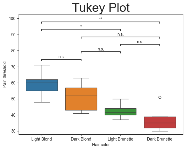
The plot function is essentially another wrapper for the py50.Stats() module, but with the default final output being the plot. All plot functions also accept **kwargs associated for Statannotations or Seaborn. Their usage can be found on their sites accordingly.
The figure can be saved by calling plt.savefig(). The example above shows a common method.
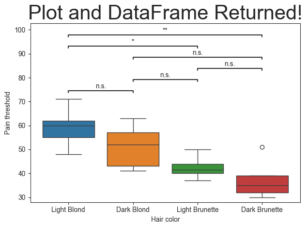
Output the Calculated DataFrame
There are times where we may want to output the statistics results alongside the image. This can be done using the return_df parameter. This will cause the plot functions to return a DataFrame and a figure in that order. If two variables are not given, then the returned DataFrame will be printed instead.
[12]:
plt.title('Plot and DataFrame Returned!', fontsize=30)
df, figure = plot.boxplot(test='tukey', value_col='Pain threshold', group_col='Hair color', return_df=True)
df
[12]:
| A | B | mean_A | mean_B | diff | se | T | p_tukey | hedges | significance | |
|---|---|---|---|---|---|---|---|---|---|---|
| 0 | Dark Blond | Dark Brunette | 51.2 | 37.4 | 13.8 | 5.168623 | 2.669957 | 0.074068 | 1.413596 | n.s. |
| 1 | Dark Blond | Light Blond | 51.2 | 59.2 | -8.0 | 5.168623 | -1.547801 | 0.435577 | -0.810661 | n.s. |
| 2 | Dark Blond | Light Brunette | 51.2 | 42.5 | 8.7 | 5.482153 | 1.586968 | 0.414728 | 0.982361 | n.s. |
| 3 | Dark Brunette | Light Blond | 37.4 | 59.2 | -21.8 | 5.168623 | -4.217758 | 0.003708 | -2.336811 | ** |
| 4 | Dark Brunette | Light Brunette | 37.4 | 42.5 | -5.1 | 5.482153 | -0.930291 | 0.789321 | -0.626769 | n.s. |
| 5 | Light Blond | Light Brunette | 59.2 | 42.5 | 16.7 | 5.482153 | 3.046249 | 0.036647 | 2.015280 | * |
Plot modifications
That looks great! But the plot looks a little busy with all of the no significance (n.s.) indicators plotted. What if these were removed and only important/relevant information was annotated to the plot?
Good news! That can be achieved by including the ‘pairs’ parameter. This will take a list of the groups (from columns A and B) and will filter the results accordingly. The pairs can be in any order, as long as the combinations can be found on the resulting DataFrame and in the [‘A’] and [‘B’] columns.
There is also a way to return the calculated DataFrame using the ‘return_df’ parameter. This is a way to check the calculated results and if they match with the pvalues calculated from the py50.Stats() module. If there are discrepancies, they can be changed manually by using the ‘pvalue_order’ parameter, which takes a list of string values. The two lits - pairs and pvalue_order - must match in length. The returned DataFrame will only contain rows matching with the pairs list.
Finally, plot titles can be passed in as a variable. This will be passed as kwargs that correspond to matplotlib. Or it can be passed using the plt.title() as seen above.
Additional examples can be seen under the `009_advanced_plotting <>`__ tutorial.
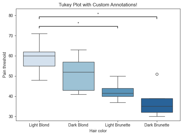
[13]:
pairs = [('Light Blond', 'Dark Brunette'), ('Light Blond', 'Light Brunette')]

# This is optional and will overwrite the significance asterisks associated with the pairs.
pvalue_order = ['p ≤ 0.01', 'p ≤ 0.05']

# Generate title for plot
title = 'Tukey Plot with Custom Annotations!'

plot.boxplot(test='mannu', value_col='Pain threshold', group_col='Hair color', title=title, fontsize=30,
             palette='Blues', pairs=pairs, pvalue_order=pvalue_order, return_df=True)
[13]:
(             A               B  U-val     p-val significance   RBC  CLES
 1  Light Blond   Dark Brunette   24.0  0.015873            *  0.92  0.96
 0  Light Blond  Light Brunette   19.0  0.031746            *  0.90  0.95,
 <statannotations.Annotator.Annotator at 0x1183366e0>)
The order of the groups can also be rearranged. This will also affect how the annotations are plotted.
For example, let’s order the groups alphabetically. This can be done with the group_order parameter. Let’s also change the color schemes where blond hair colors are “seagreen” and brunette hair colors are “royalblue”.
[14]:
group_order = ['Dark Blond', 'Dark Brunette', 'Light Blond', 'Light Brunette']
palette = ['seagreen', 'royalblue', 'darksalmon', 'lightskyblue']

# Generate title for plot
title = 'Tukey Plot with Custom Annotations!'

plot.boxplot(test='tukey', value_col='Pain threshold', group_col='Hair color', palette=palette, pairs=pairs,
             title=title, fontsize=30, pvalue_order=pvalue_order, group_order=group_order, return_df=True)
[14]:
(               A               B  mean_A  mean_B  diff        se         T  \
 0  Dark Brunette     Light Blond    37.4    59.2 -21.8  5.168623 -4.217758
 1    Light Blond  Light Brunette    59.2    42.5  16.7  5.482153  3.046249

     p_tukey    hedges significance
 0  0.003708 -2.336811           **
 1  0.036647  2.015280            *  ,
 <statannotations.Annotator.Annotator at 0x1184583d0>)
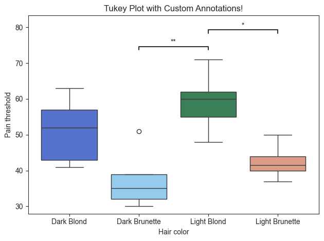
The color of the plot can also be modified using the palette parameter. As seen above, the palette can be divergent color scheme, such as “Blues”, or distinct colors can be used. Input for distinct colors must be in a list.
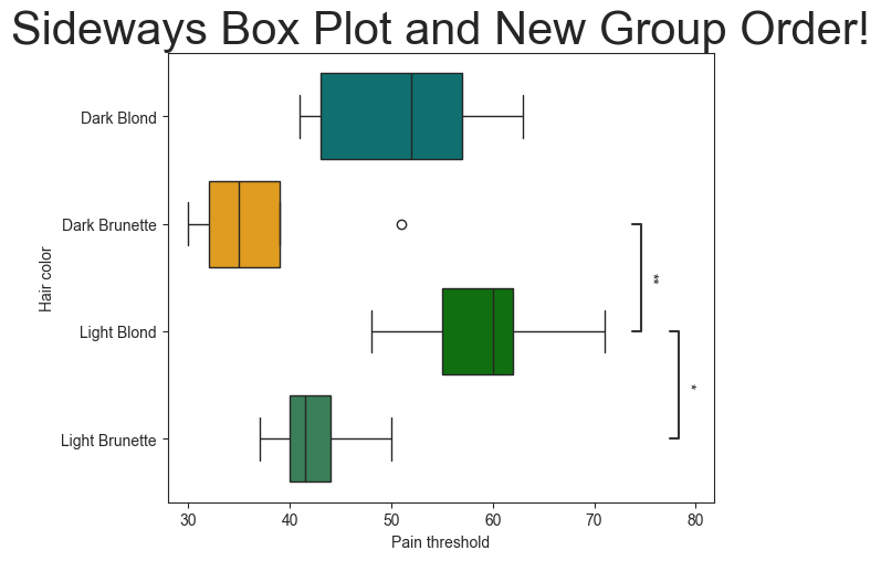
The orientation of the plot can also be rotated from vertical to horizontal using the ‘orient’ parameter.
The groups can also be reordered using the ‘group_order’ parameter. Let’s place the groups in alphabetical order.
[15]:
# Specify color and rotate
group_order = ['Dark Blond', 'Dark Brunette', 'Light Blond', 'Light Brunette']
palette = ['green', 'teal', 'seagreen', 'orange']

plot.boxplot(test='tukey', value_col='Pain threshold', group_col='Hair color', pairs=pairs,
             palette=palette, group_order=group_order, orient='h')
plt.title('Sideways Box Plot and New Group Order!', fontsize=30)
[15]:
Text(0.5, 1.0, 'Sideways Box Plot and New Group Order!')
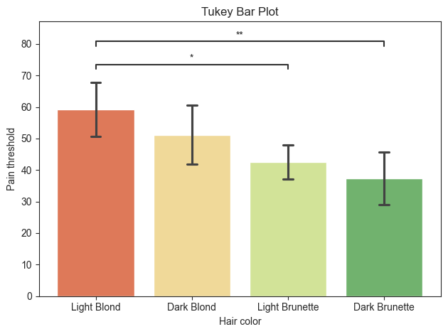
Bar Plot
py50 contains functions for additional plot types. Again, they will accept the same parameters as the box_plot, as well as **kwargs associated with their respective Seaborn counterparts.
[16]:
title = 'Tukey Bar Plot'

plot.barplot(test='tukey', value_col='Pain threshold', group_col='Hair color', palette='RdYlGn', hide_ns=True,
             title=title, fontsize=30)
[16]:
<statannotations.Annotator.Annotator at 0x118105990>
Violin Plot
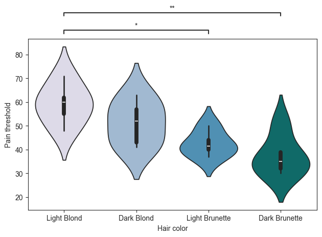
There are times when the annotations may be drawn on top of the figure. During testing, I found this occurs regularly with the violin or swarm plot. A workaround is to use the ‘loc’ parameter. This will place the annotations outside of the plot. The downside is that this will interfere with the title of the plot. In otherwords, if this paramter is used, it is best to remove the plot title.
[17]:
plot.violinplot(test='tukey', value_col='Pain threshold', group_col='Hair color', palette='PuBuGn', pairs=pairs,
                loc='outside')
[17]:
<statannotations.Annotator.Annotator at 0x118668460>
Swarm Plot
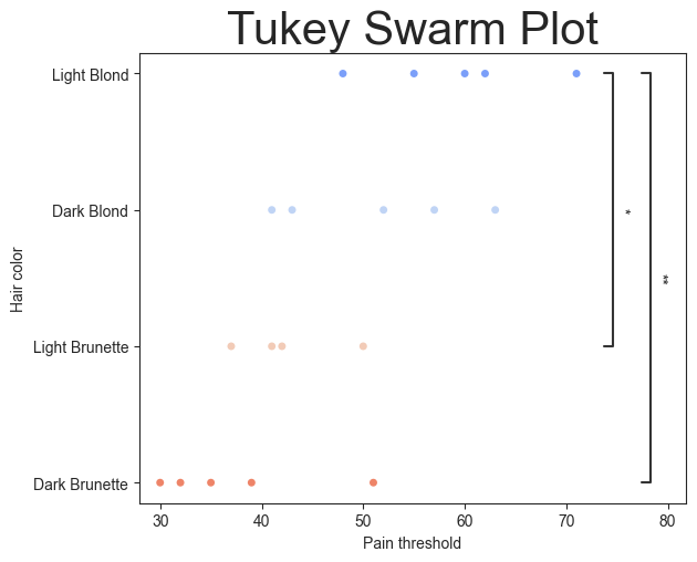
There is also a swarm plot available. Again, it takes all the same parameters as above and with its respective Seaborn **kwargs.
[18]:
plot.swarmplot(test='tukey', value_col='Pain threshold', group_col='Hair color', palette='coolwarm', pairs=pairs,
               orient='h')
plt.title('Tukey Swarm Plot', fontsize=30)
[18]:
Text(0.5, 1.0, 'Tukey Swarm Plot')
[19]:
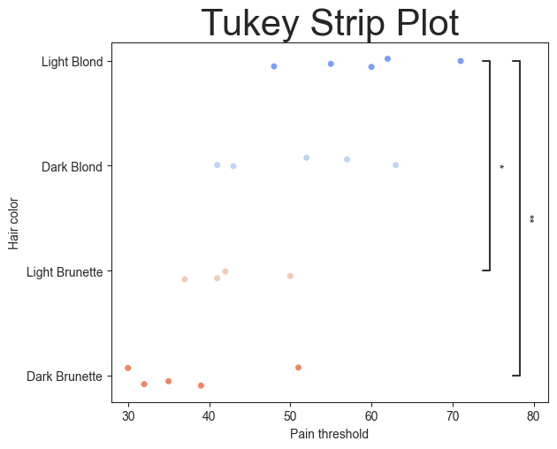
plot.stripplot(test='tukey', value_col='Pain threshold', group_col='Hair color', palette='coolwarm', pairs=pairs,
               orient='h')
plt.title('Tukey Strip Plot', fontsize=30)
[19]:
Text(0.5, 1.0, 'Tukey Strip Plot')
scikit-posthocs
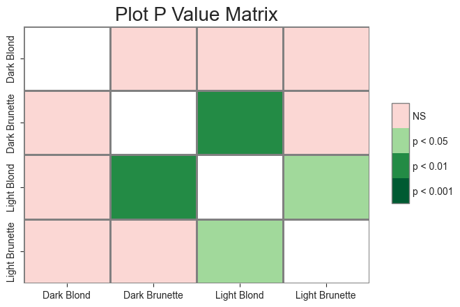
Finally, a heatmap of pvalues can be generated. This script is a wrapper for the scikit-posthoc tool. This is a good alternative to show a “clean” plot without annotations and have the pvalues represented on the side. It also offers a quick way to visualize the relationship between the groups.
In order to create the pvalue heatmap, a matrix of the pvalues must be created. This is done using the ‘get_p_matrix’ from the Stats() module, as seen below. The output will be a DataFrame.
[20]:
# Replace all string values with a new value
matrix_df = Stats.get_p_matrix(data=tukey, test='tukey', group_col1='A', group_col2='B')
matrix_df
[20]:
| Dark Blond | Dark Brunette | Light Blond | Light Brunette | |
|---|---|---|---|---|
| Dark Blond | 1.000000 | 0.074068 | 0.435577 | 0.414728 |
| Dark Brunette | 0.074068 | 1.000000 | 0.003708 | 0.789321 |
| Light Blond | 0.435577 | 0.003708 | 1.000000 | 0.036647 |
| Light Brunette | 0.414728 | 0.789321 | 0.036647 | 1.000000 |
Once the pvalues are created in a matrix, the resulting DataFrame can be “fed” into the ‘p_matrix’ function in the Plots() module. There are many paramters for modifications available as the **kwargs, which can be found on the scikist-posthocs documentation page.
[21]:
# matrix_plot = Plots.p_matrix(matrix_df, title='Plot P Value Matrix', title_fontsize=20, linewidth=1, linecolor='0.5')
title = 'Plot P Value Matrix'
matrix = Plots(matrix_df)
matrix.p_matrix(title=title, titlesize=20, linewidth=1, linecolor='0.5')
[21]:
(<Axes: title={'center': 'Plot P Value Matrix'}>,
 <matplotlib.colorbar.Colorbar at 0x1183e3820>)
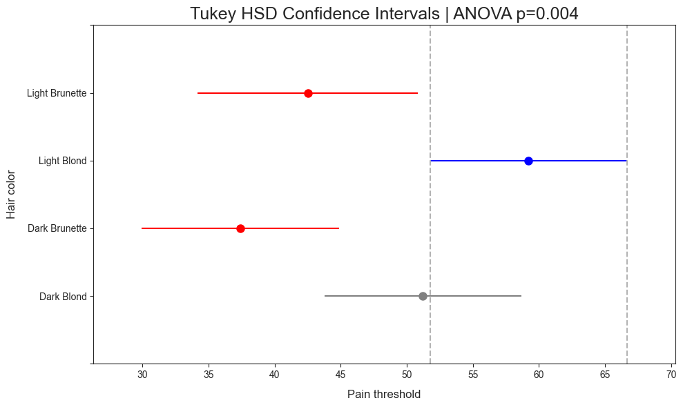
Confidence Interval Plot
There are times when a project contains mutliple variabls to compare. This can result in an “ugly” image. For example, cell 11 appears to be the limit annotattions available. While this could possibly be remedied by hiding the n.s. labels using the “hide_ns” argument, another option is available. This is where the ci_plot method comes in.
This plot was included after reading a post by Pat Walters. This plot utilizes the Tukey’s Honest Significant Difference (HSD) Test from statsmodels. The ci_plot wraps the function and includes default naming scheme. For instance, the title will include a specific name and the results of the ANOVA test (rounded to 3 sigfigs).
Plot is read as:
Blue line denotes the highest mean
Gray line denotes equivalency to the blue line
Red line indicates no significance to the blue line.
[22]:
title = "Tukey HSD Confidence Intervals"
plot.ci_plot(data=data, value_col='Pain threshold', group_col="Hair color", title=title)