Multi Cruve plot
Depending on the user needs, more information may be conveyed by displaying a graph with multiple curves. This can be done with py50 using the multi_curve_plot() method.
First, import the package and convert the DataFrame instantiate into the PlotCurve class.
[1]:
import pandas as pd
from py50 import PlotCurve, CBMARKERS, CBPALETTE
[2]:
df = pd.read_csv('../dataset/multiple_example.csv')
data = PlotCurve(df)
data.show()
[2]:
| Compound Name | Compound Conc | % Inhibition 1 | % Inhibition 2 | % Inhibition Avg | |
|---|---|---|---|---|---|
| 0 | Drug 1 | 100000.0 | 90 | 94 | 92.0 |
| 1 | Drug 1 | 33300.0 | 97 | 89 | 93.0 |
| 2 | Drug 1 | 11100.0 | 86 | 89 | 87.5 |
| 3 | Drug 1 | 3700.0 | 81 | 88 | 84.5 |
| 4 | Drug 1 | 1240.0 | 63 | 70 | 66.5 |
The multi_curve_plot() method has many arguments. Here we will utilize the basic methods to generate our first figure.
[3]:
figure = data.multi_curve_plot(name_col='Compound Name',
                               concentration_col='Compound Conc',
                               response_col='% Inhibition Avg',
                               title='Multi-Curve Plot',
                               xlabel='Logarithmic Concentration (nM)',
                               ylabel='Response %',
                               legend=True,
                               line_color=CBPALETTE,
                               marker=CBMARKERS)
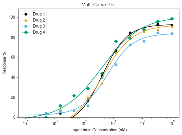
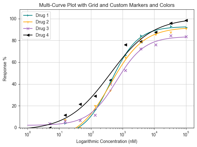
By default, the multi_curve_plot() function will utilize the colorlbind palette and markers. This can be customized depending on the user’s needs. For color, inputs can be modified using the name of the color or hex codes. The marker styling can be found here. If both are to be modified, they should placed as a list. A grid can also be drawn by passing the ‘grid=True’ keyword argument.
[4]:
figure = data.multi_curve_plot(name_col='Compound Name',
                               concentration_col='Compound Conc',
                               response_col='% Inhibition Avg',
                               title='Multi-Curve Plot with Grid and Custom Markers and Colors',
                               xlabel='Logarithmic Concentration (nM)',
                               ylabel='Response %',
                               legend=True,
                               line_color=['#008080', 'orange', '#A569BD', 'black'],
                               marker=['4', '1', 'x', '<'],
                               grid=True)
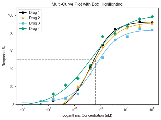
Highlight Absolute IC50
The Absolute IC50 for a particular drug can be highlighted. This can be used to quickly gauge the IC50 of the other curves accordingly. By default, the box will highlight the Absolute IC50 value. But it can also be modified using the “box_intersection=” argument when needed.
[5]:
figure = data.multi_curve_plot(name_col='Compound Name',
                               concentration_col='Compound Conc',
                               response_col='% Inhibition Avg',
                               title='Multi-Curve Plot with Box Highlighting',
                               xlabel='Logarithmic Concentration (nM)',
                               ylabel='Response %',
                               legend=True,
                               box_target='Drug 2')
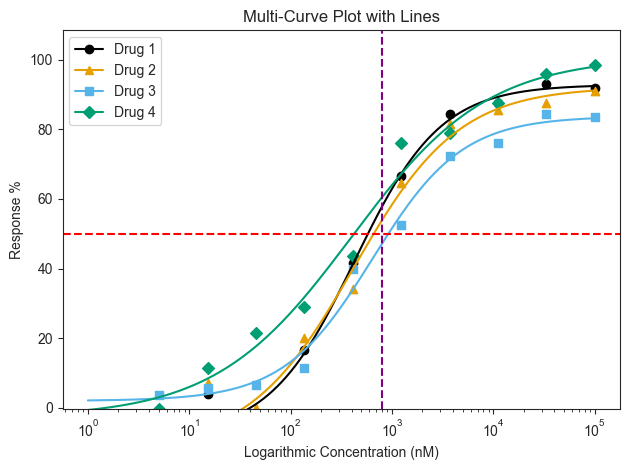
The box highlight can only highlight 1 curve. If users want to highlight a specific range across all curves, it would be better to use the line highlighting either the Response or Concentration. This line will extend across the entire plot and use the hline and vline arguments respectively.
[6]:
figure = data.multi_curve_plot(name_col='Compound Name',
                               concentration_col='Compound Conc',
                               response_col='% Inhibition Avg',
                               title='Multi-Curve Plot with Lines',
                               xlabel='Logarithmic Concentration (nM)',
                               ylabel='Response %',
                               legend=True,
                               hline=50,
                               hline_color='red',
                               vline=800,
                               vline_color='purple')