Plot in Grid
Multiple dose-response curves can also be plotted in a grid format. This is achieved using the grid_curve_plot() method.
First, import the necessary packages. Import the example dataset and instantiate it into the PlotCurve() class.
[1]:
import pandas as pd
from py50 import PlotCurve, CBPALETTE
[2]:
df = pd.read_csv('../dataset/multiple_example.csv')
data = PlotCurve(df)
data.show(2)
[2]:
| Compound Name | Compound Conc | % Inhibition 1 | % Inhibition 2 | % Inhibition Avg | |
|---|---|---|---|---|---|
| 0 | Drug 1 | 100000.0 | 90 | 94 | 92.0 |
| 1 | Drug 1 | 33300.0 | 97 | 89 | 93.0 |
Plot Curves in a Grid
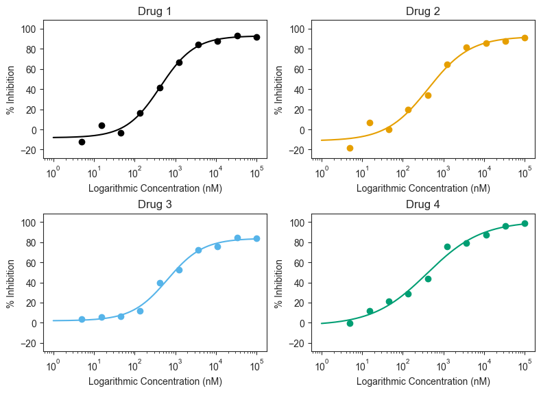
The grid_curve_plot() method has many arguments. Here we will utilize the basic methods to generate our first figure. By default, it will generate the plots in a 2 x 1 grid. As the example includes 4 drugs, we will adjust the figsize to compensate.
[3]:
figure = data.grid_curve_plot(name_col='Compound Name',
                              concentration_col='Compound Conc',
                              response_col='% Inhibition Avg',
                              xlabel='Logarithmic Concentration (nM)',
                              ylabel='% Inhibition',
                              figsize=(8, 6))
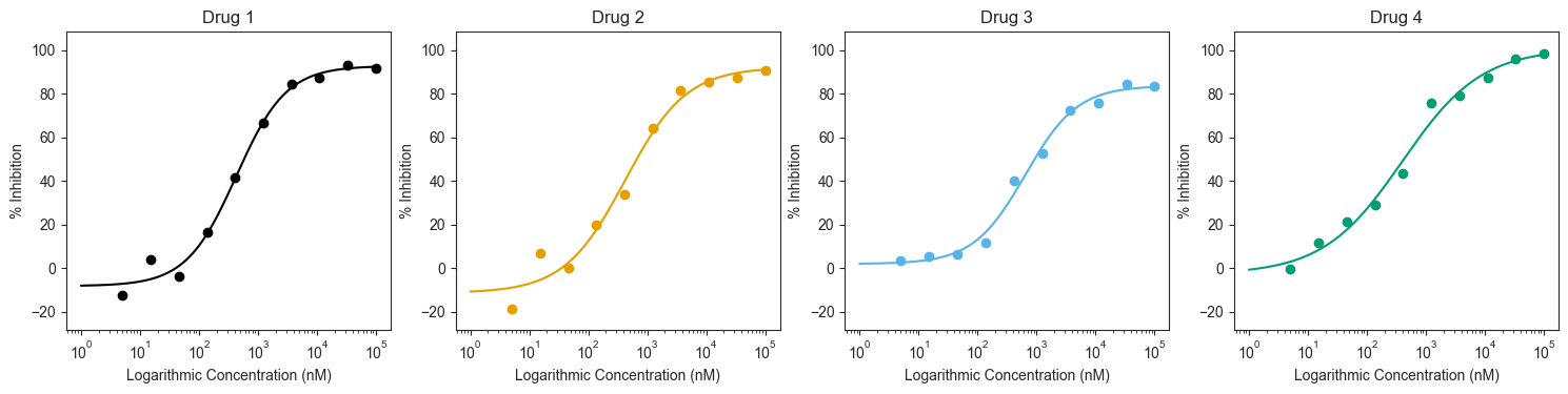
Adjust Grid Positions
We can reposition how the plots are laid out using the “column_num=” argument. Note that if this argument is called, the figures will be “distorted”. The subplots can be adjusted by including the “figsize=” argument and adjusting the size accordingly.
Each curve can also be adjusted. The input color must be given as a list, where the length must match the number of the drugs being plotted. The list can contain color names (red, blue, green, etc) or colors in hex codes. By default, the colorblind friendly colors and markers are used.
[4]:
figure = data.grid_curve_plot(name_col='Compound Name',
                              concentration_col='Compound Conc',
                              response_col='% Inhibition Avg',
                              xlabel='Logarithmic Concentration (nM)',
                              ylabel='% Inhibition',
                              column_num=4,
                              line_color=CBPALETTE,
                              figsize=(15, 4))
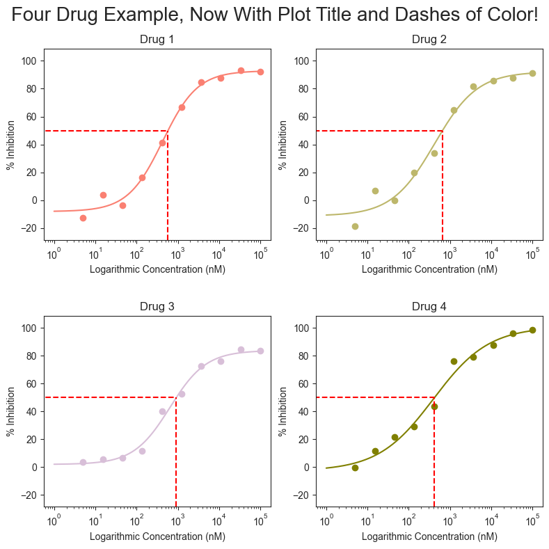
Highlight response and concentration
The figures can be further modified to add a title, adjust the line colors, and highlight the Absolute IC50 for each drug. The arguments are similar to those seen in the previous tutorials for single_curve_plots or for multi_curve_plots.
[5]:
import matplotlib.pyplot as plt
figure = data.grid_curve_plot(name_col='Compound Name',
                              concentration_col='Compound Conc',
                              response_col='% Inhibition Avg',
                              title='Four Drug Example, Now With Plot Title and Dashes of Color!',
                              xlabel='Logarithmic Concentration (nM)',
                              ylabel='% Inhibition',
                              line_color=['#FA8072', '#BDB76B', '#D8BFD8', '#808000'],
                              box=True,
                              box_color='red',
                              figsize=(8, 8), savefig='test.png')
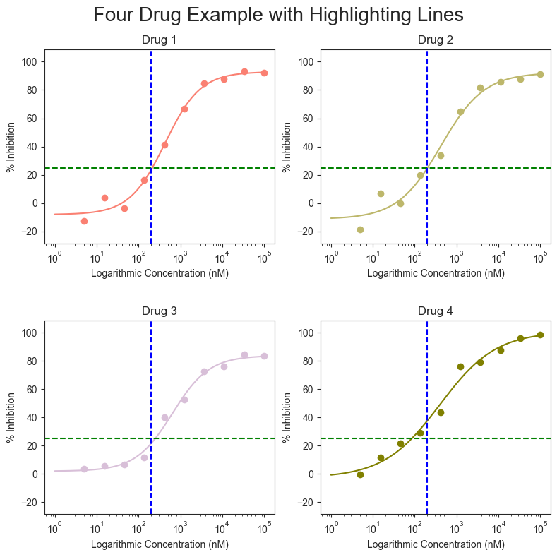
Vertical and Horizontal Highlighting
A vertical and horizontal line stretching across the entire plot can be drawn that instead of the box. Their colors can also be set based on the user inputs.
[6]:
figure = data.grid_curve_plot(name_col='Compound Name',
                              concentration_col='Compound Conc',
                              response_col='% Inhibition Avg',
                              title='Four Drug Example with Highlighting Lines',
                              xlabel='Logarithmic Concentration (nM)',
                              ylabel='% Inhibition',
                              line_color=['#FA8072', '#BDB76B', '#D8BFD8', '#808000'],
                              vline=200,
                              vline_color='blue',
                              hline=25,
                              hline_color='green',
                              figsize=(8, 8))